When it comes to doing home decor, color coordination is a very important aspect. However, many homeowners make ugly mistakes that can detract from the overall aesthetic appeal of their living space. In this article, I’ll explore some of these color coordination errors and provide practical tips on how to avoid them.
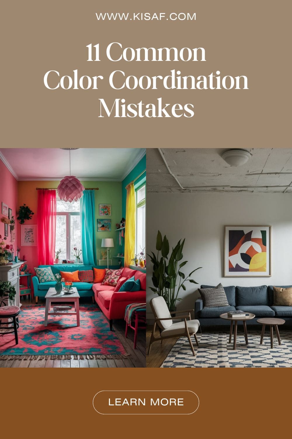
- Color Coordination Mistakes
- 1. Ignoring the Color Wheel
- 2. Overlooking Undertones
- 3. Using Too Many Colors
- 4. Neglecting the 60-30-10 Rule
- 5. Forgetting About Texture
- 6. Disregarding the Psychology of Color
- 7. Pattern Overload
- 8. Ignoring Natural Light
- 9. Failing to Consider Flow
- 10. Neglecting the Ceiling
- 11. Overlooking the Power of Neutrals
- Conclusion
Color Coordination Mistakes
These are some mistakes that I think you guys might be making but if you think I missed any of the mistakes then please let me know in the comments.
1. Ignoring the Color Wheel
One of the most fundamental color coordination mistake is that we tend to disregard the color wheel. The color wheel is a valuable tool that can help you create harmonious color schemes in your home.
When you set the primary color in the color wheel, then it inform you about the complementary color. So, you can easily create a color scheme.
By understanding the relationships between colors, you can create visually pleasing combinations that enhance your home’s décor.
2. Overlooking Undertones
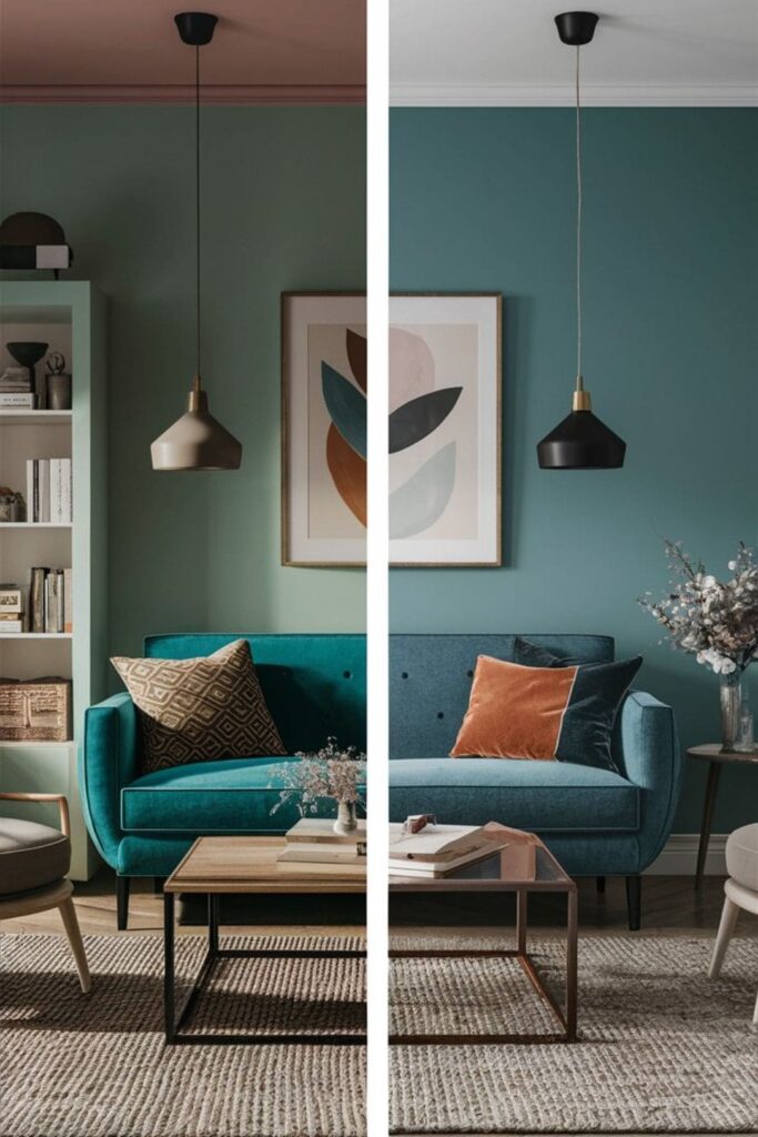
Another common color coordination mistake is overlooking undertones when selecting paint colors, fabrics, or furnishings. Now, you might ask, what is an undertone? Undertones are subtle hues that can influence how a color appears in different lighting conditions.
For example, a beige paint with a pink undertone might clash with furnishings that have a yellow undertone. To avoid this mistake, make sure to consider the undertones of each element in your home and ensure they complement rather than clash with one another.
3. Using Too Many Colors
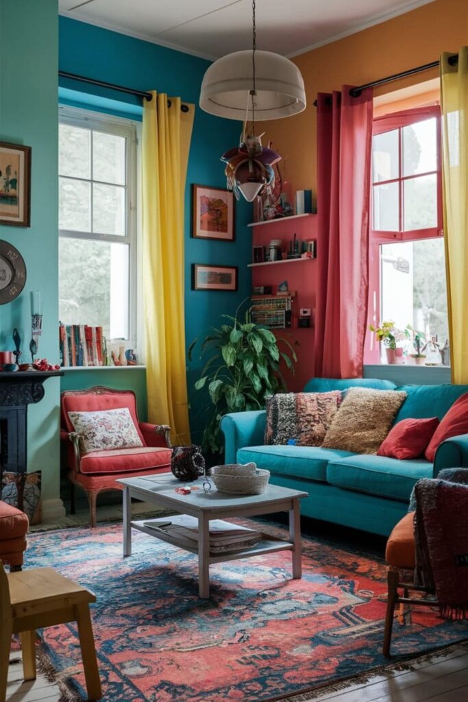
While it’s tempting to add a load of colors into your home décor, using too many can result in a chaotic and rather ugly space.
Instead, aim for a simple color palette with one or two dominant colors and one or two accent colors. You can just keep everything simple by having a monochromatic(single) color room.
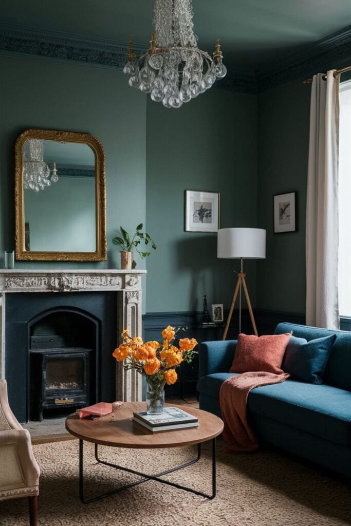
4. Neglecting the 60-30-10 Rule
The 60-30-10 rule is a simple guideline for achieving balanced color coordination in a room. According to this theory, 60% of the room’s color should be a dominant color, 30% should be a secondary color, and 10% should be an accent color.
This ensures that one color doesn’t overpower the room while still allowing for variation and contrast. You can find plenty of videos on YouTube that explain this theory. So, if you have time then check them out.
5. Forgetting About Texture
In addition to color, textures do play a crucial role in creating a visually better space in your home. Mixing different textures, such as smooth fabrics, rough wood, and shiny metals, can add depth to your décor.
However, it’s important to think about how the textures will interact with colors to ensure a cohesive overall look.
For example, pairing a bold, textured rug with muted, smooth furniture can create a striking contrast that enhances the room’s aesthetic appeal.
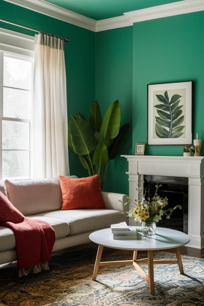
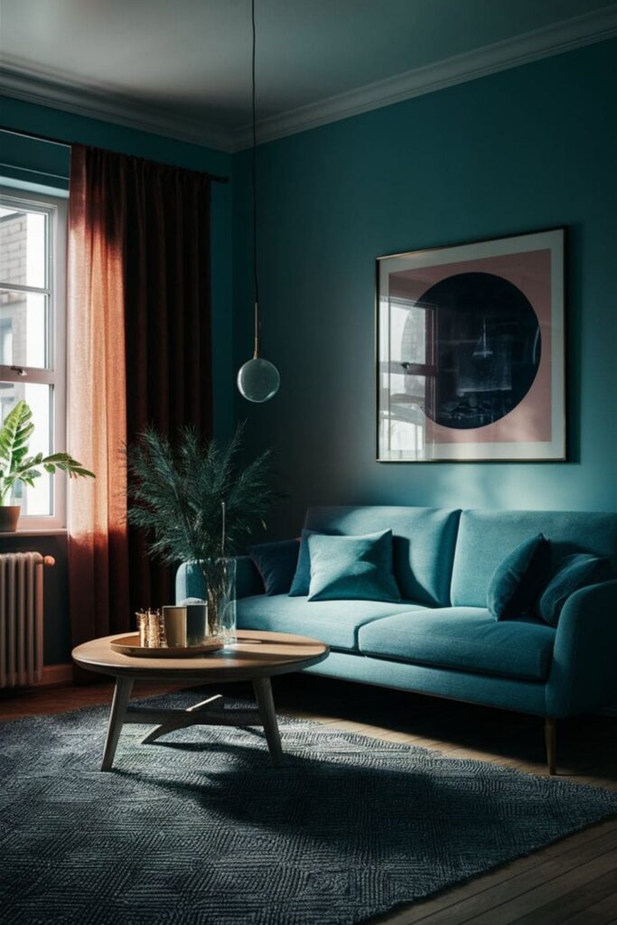
6. Disregarding the Psychology of Color
Colors can change ones emotions and moods, so it’s important to consider the psychology of color when designing your home.
For example, blue is often associated with calmness and tranquility, making it an excellent choice for bedrooms or living rooms.
On the other hand, red is a vibrant and energizing color that can add warmth and excitement to a space. By understanding how different colors impact mood, you can create the perfect home environment.
7. Pattern Overload
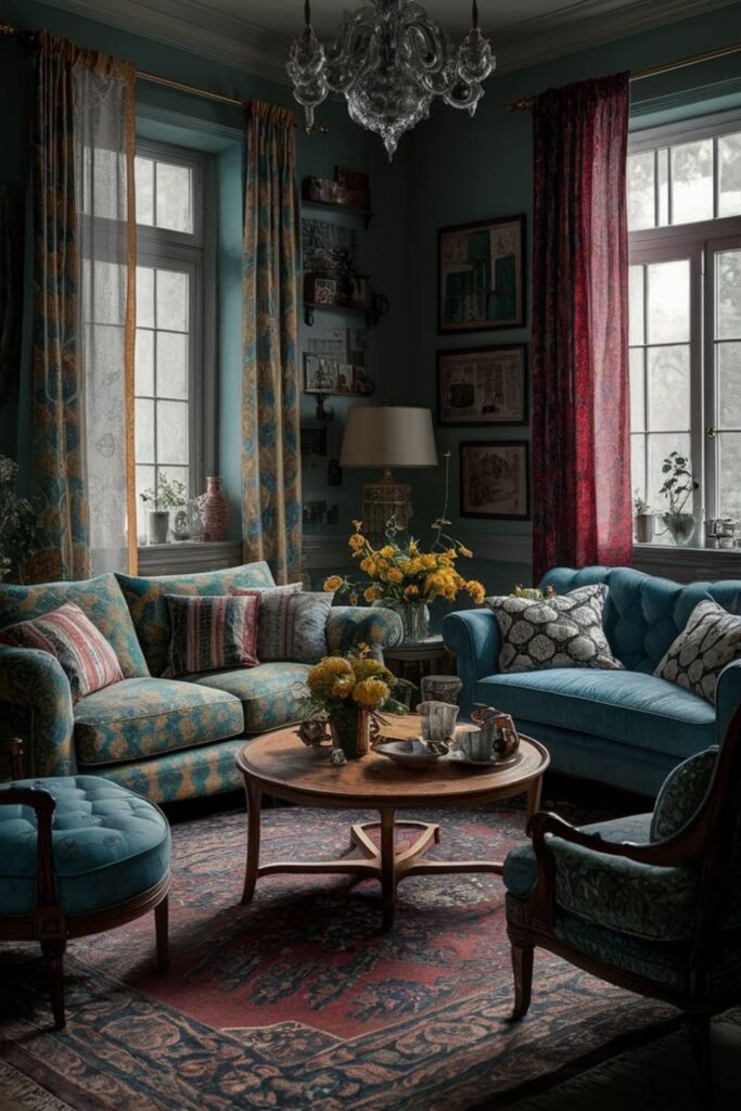
Another common home decor mistake is that people tend to overuse patterns in their room. Overloading a room with too many different patterns can lead to visual overload and confusion.
It’s important to establish balance between patterned and solid elements in your decor. Choose a mix of patterns in different scales and textures to create depth without cluttering the space.
And again, I would say that stick to a simple color palette to tie everything together seamlessly.
8. Ignoring Natural Light
A room without natural light looks very dull and non-welcoming. However, many homeowners overlook this factor when selecting paint colors or furnishings.
For example, a color that looks bright and cheerful in a room with natural light may appear dull and lifeless in a darker space.
To avoid this mistake, check the orientation of your windows and how natural light affects the colors in each room before making your final choices.
9. Failing to Consider Flow
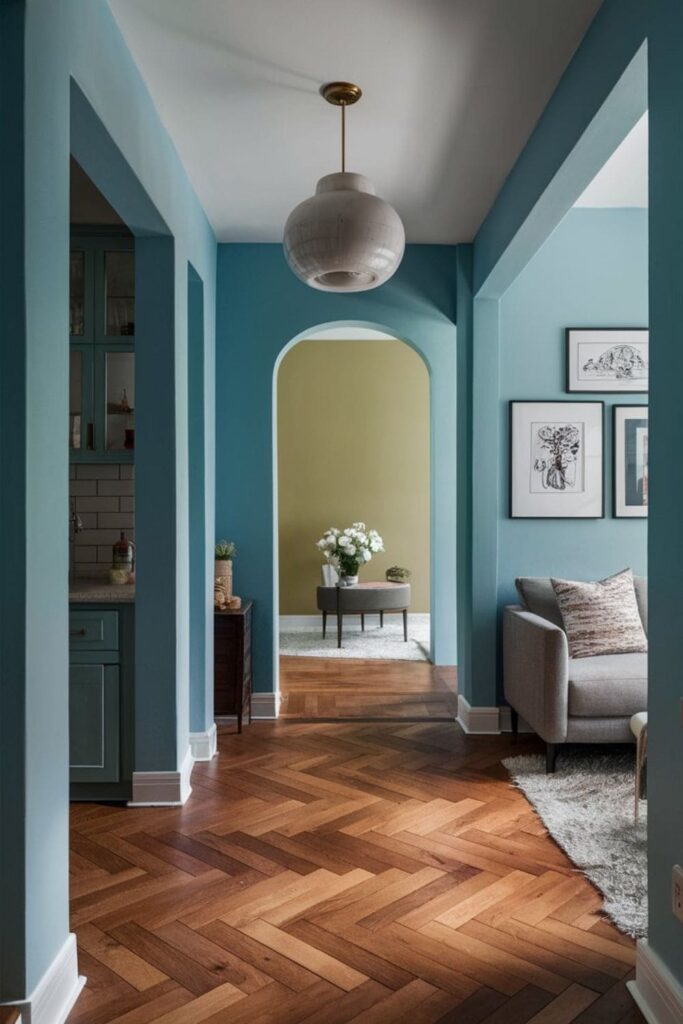
Flow is very important for creating a harmonious look throughout your home. However, many homeowners make this home decor mistake of using vastly different color schemes in adjacent rooms.
Which disturbs the visual continuity. To maintain flow, choose a simple and cohesive color palette that transitions smoothly from room to room.
10. Neglecting the Ceiling
The ceiling is often referred to as the “fifth wall” and helps add color and interest to a room. However, many homeowners make this home decor mistake and ignore this surface, leaving it white or off-white.
To make the most of your ceiling, consider painting it a complementary color to the walls or using a bold accent color to create visual impact.
This simple addition can really help tie the room together.
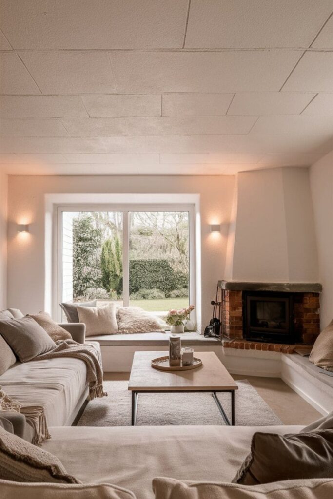
11. Overlooking the Power of Neutrals
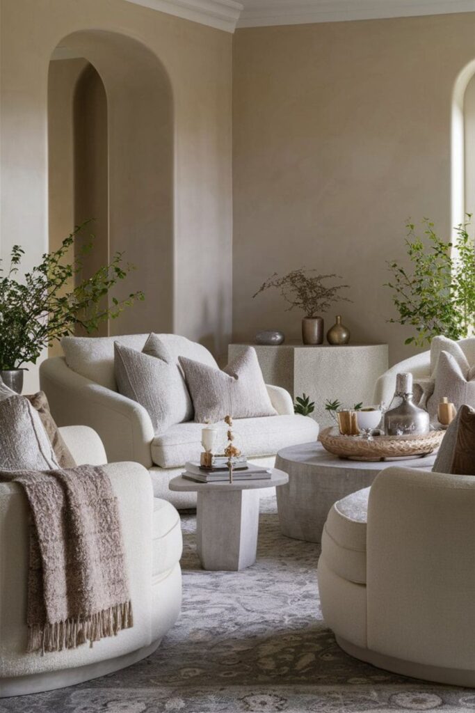
While bold colors can make a bold statement, neutral colors play an important role in balancing a room’s color palette.
However, you might make the mistake of overlooking the power of neutrals and opting for overly saturated hues instead.
Adding neutral tones such as white, beige, or gray can provide a calming stop for more vibrant accents while creating a sophisticated look.
Conclusion
In the end, color coordination mistakes can disturb the overall aesthetic appeal of your home. So, you should avoid them every time you do home decor.
By avoiding common mistakes listed above such as ignoring the color wheel, overlooking undertones, using too many colors, neglecting the 60-30-10 rule, forgetting about texture, and disregarding the psychology of color, you can create a beautiful living space that reflects your personal style.
So, take the time to carefully consider your color choices and enjoy the transformative power of a well-coordinated home.